Home
About
Design Services
Clients
Contact
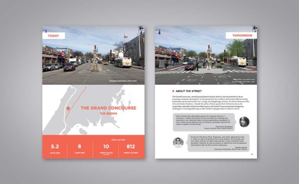
Report Design
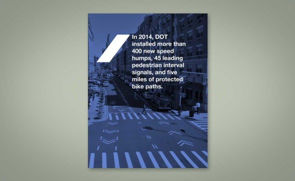
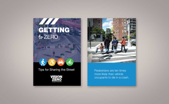
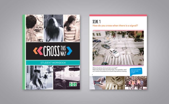
Vision Zero Public Outreach
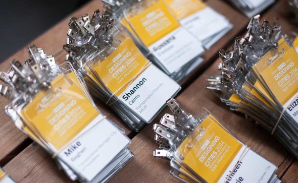
Conference Design
Photo Rendering
Teaching Tools
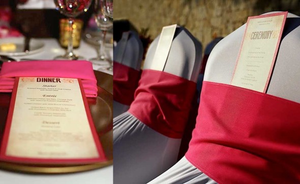
Wedding Design